Redesigning Aetna Student Health

Redesigning Aetna Student Health

CVS Health | Aetna

CVS Health | Aetna

My role

My role

Senior UX Designer

Senior UX Designer

The team

The team

PM, Lead Designer, Senior Designer and Content Designer

PM, Lead Designer, Senior Designer and Content Designer

Duration

Duration

5 months

5 months

Main project image
Main project image

I joined a 6-month redesign at the halfway point and shipped 20+ pages across the main site, member resources, and footer. In addition to the stats below, the new platform also reduced ongoing maintenance time for content authors by restructuring how plan documents, resources, and forms are shared across schools.

Aetna Student Health (ASH) provides health insurance to college students across 33 states, with international students making up roughly a third of its member base. The existing website was over 10 years old: 7,400 pages of dense content, no design system, accessibility gaps, and navigation that hadn't kept pace with how students use sites online. I'd moved to the US from the UK myself and knew firsthand how disorienting US insurance terminology could be. The redesign was timed to a September school onboarding kickoff and aligned with CVS Health's Healthier Happens Together platform; a member-first business direction that shaped voice, tone, and imagery across every page. The redesign was built around three user types:

First time enrollees: A US college student signing up for a plan, often without much prior insurance literacy. International Students: Landing in the US and navigating American healthcare for the first time, frequently in a second language. School Administrators: Managing student health insurance for their institution and onboarding new cohorts.

A competitive analysis was provided at the start of the project. From there, I worked from the established style and component direction into high-fidelity mockups in Figma, iterating page by page based on weekly stakeholder feedback. I had regular crits, working sessions, and 1:1 reviews with my Lead Designer, and partnered closely with the Content Designer, discussing the best content strategy for each page, then reviewing their copy together. Once designs were approved, they were annotated and handed off to authors who implemented them in Adobe Experience Manager (AEM). I added post-handoff check-ins where helpful to catch implementation drift early.

Every page had to work within a tight, layered set of constraints: Aetna design system. All components had to come from or extend the existing system. Accessibility. WCAG 2.1 AA conformance was required across all pages. Compliance. HIPAA and other healthcare regulations governed how member information could be presented. Brand layering. Aetna brand sat on top of CVS Health, with ASH as a sub-brand and individual schools (CSCU, Stanford, USC) layered on top of that.

In an external study completed of 19-26 year olds, we gathered the following key insights: Strong preference for streamlined processes Need straightforward information Clearer guidance and resources to assist them  Dependent on friends/family for advice

Core issue

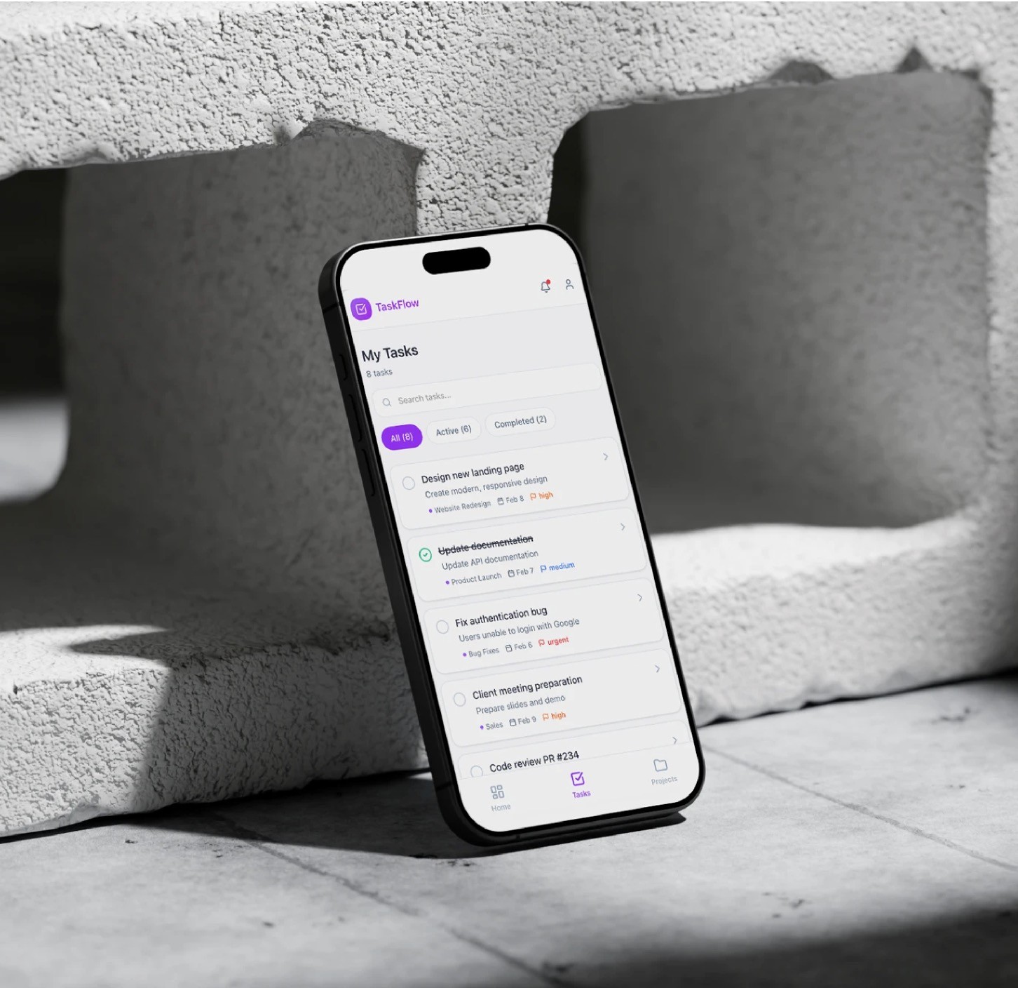
The product lacked a clear prioritization model. All tasks were visually similar, forcing users to manually interpret urgency and importance. This increased cognitive load and reduced confidence when planning daily work.

Business issue

If users couldn't manage priorities efficiently, engagement dropped and teams relied on external tools to organize their work. Improving clarity and focus was critical to increase daily usage and long-term retention.

Every page had to work within a tight, layered set of constraints: Aetna design system. All components had to come from or extend the existing system. Accessibility. WCAG 2.1 AA conformance was required across all pages. Compliance. HIPAA and other healthcare regulations governed how member information could be presented. Brand layering. Aetna brand sat on top of CVS Health, with ASH as a sub-brand and individual schools (CSCU, Stanford, USC) layered on top of that.

In an external study completed of 19-26 year olds, we gathered the following key insights: Strong preference for streamlined processes Need straightforward information Clearer guidance and resources to assist them  Dependent on friends/family for advice

Core issue

The product lacked a clear prioritization model. All tasks were visually similar, forcing users to manually interpret urgency and importance. This increased cognitive load and reduced confidence when planning daily work.

Business issue

If users couldn't manage priorities efficiently, engagement dropped and teams relied on external tools to organize their work. Improving clarity and focus was critical to increase daily usage and long-term retention.

Project image
Project image

Discovery

To understand real workflows, I ran a discovery phase focused on how users plan, review, and execute tasks throughout the day.

Discovery

To understand real workflows, I ran a discovery phase focused on how users plan, review, and execute tasks throughout the day.

Research methods

Customer interview

10 interviews with individual contributors leads to understand planning habits and pain points.

Workshops

We ran collaborative workshops with product, engineering, and design to align on the problems.

Survey

A short survey to validate common frustrations around task overload and prioritization.

Quantitative data

Review of feature usage to identify underused or confusing areas of the product.

User test

Task-based tests to observe how users create, prioritize, and complete tasks.

Research methods

Customer interview

10 interviews with individual contributors leads to understand planning habits and pain points.

Workshops

We ran collaborative workshops with product, engineering, and design to align on the problems.

Survey

A short survey to validate common frustrations around task overload and prioritization.

Quantitative data

Review of feature usage to identify underused or confusing areas of the product.

User test

Task-based tests to observe how users create, prioritize, and complete tasks.

Findings

Findings

Research highlighted recurring patterns in daily task creation workflows.

Research highlighted recurring patterns in daily task creation workflows.

Needs

Users plan work in short cycles

Most users focus on what needs to be done today rather than long-term task lists.

Visual clarity impacts execution

When priorities are visually clear, users move faster and feel more in control.

Too many views create friction

When priorities are visually clear, users move faster and feel more in control.

Pain points

Task overload

Large task lists made it difficult to identify what's the most important things.

Unclear priorities

Urgent and non-urgent tasks looked the same, increasing decision fatigue.

Needs

Users plan work in short cycles

Most users focus on what needs to be done today rather than long-term task lists.

Visual clarity impacts execution

When priorities are visually clear, users move faster and feel more in control.

Too many views create friction

When priorities are visually clear, users move faster and feel more in control.

Pain points

Task overload

Large task lists made it difficult to identify what's the most important things.

Unclear priorities

Urgent and non-urgent tasks looked the same, increasing decision fatigue.

Workshops: Vision alignment

Workshops: Vision alignment

Cross-functional workshops helped align on a shared principle: a task manager should guide focus, not just store tasks. The team agreed to prioritize clarity, intentional defaults, and progressive disclosure over feature richness.

Cross-functional workshops helped align on a shared principle: a task manager should guide focus, not just store tasks. The team agreed to prioritize clarity, intentional defaults, and progressive disclosure over feature richness.

Project image
Project image
Project image
Project image
Project image
Project image
Project image
Project image
Project image
Project image

Define, Valitation, iterate

Wireframing and testing

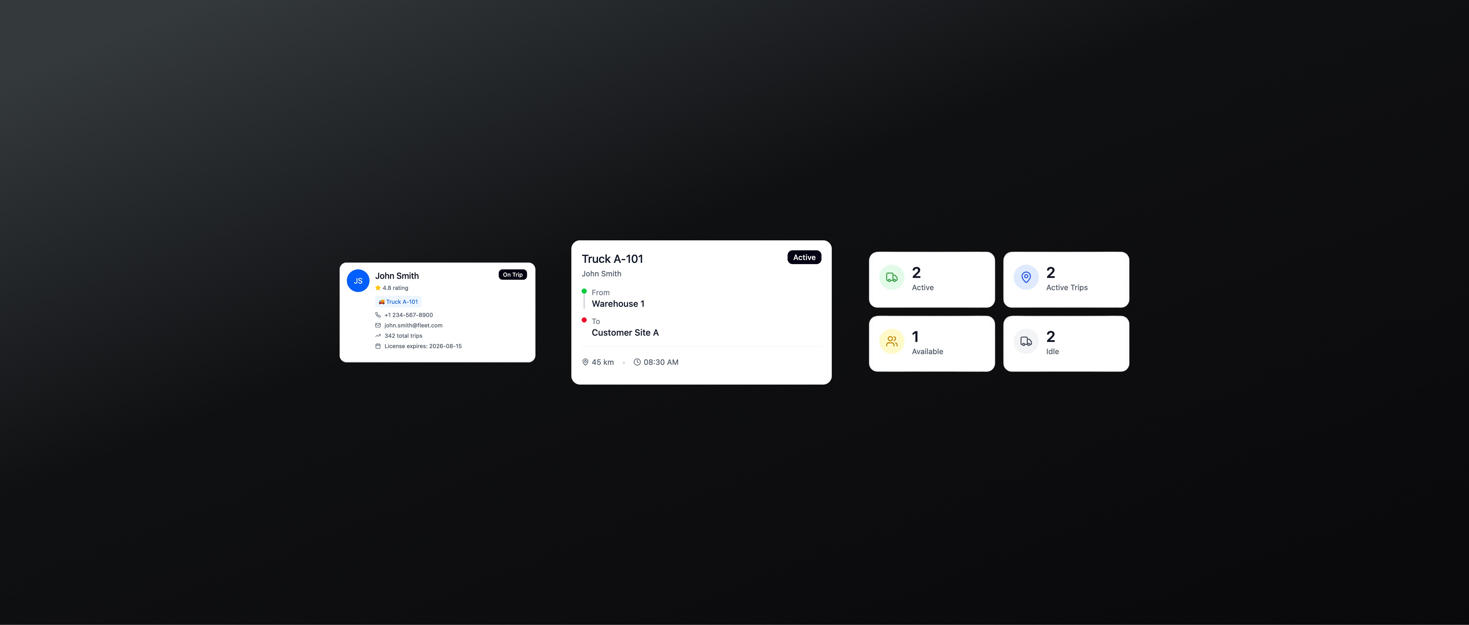
Low-fidelity wireframes were used to explore multiple prioritization models. Each iteration was revied intornally and tested with users bofore moving to higher fidelity designs.
Project image
Project image

Feedback from customers

Users described the experience as calmer and more focused. They appreciated having fewer decisions to make before starting work.

Positive feedbacks

Usage

Users consistently relied on the main task list and daily planning view, confirming that the simplified structure helped them stay focused on priorities without feeling overwhelmed.

Task completion confidence

Clear task states and visual hierarchy increased users' confidence in marking tasks as done, reducing hesitation and double-checking behavior.

Gesture-based interaction

Secondary tools were used intentionally, reducing accidental interactions and error.

Feedback from customers

Users described the experience as calmer and more focused. They appreciated having fewer decisions to make before starting work.

Positive feedbacks

Usage

Users consistently relied on the main task list and daily planning view, confirming that the simplified structure helped them stay focused on priorities without feeling overwhelmed.

Task completion confidence

Clear task states and visual hierarchy increased users' confidence in marking tasks as done, reducing hesitation and double-checking behavior.

Gesture-based interaction

Secondary tools were used intentionally, reducing accidental interactions and error.

Core workspace usage
85%
Communication engagement
65%
Visual data reliance
92%
Secondary features usage
48%
Advanced feature adoption
73%

Outcome and impact

The redesigned Live Operations view was rolled out progressively to a subset of FleetSync customers managing medium and large fleets. The new experience focused on improving situational awareness, reducing reaction time, and supporting faster decision-making during daily operations.

Outcome and impact

The redesigned Live Operations view was rolled out progressively to a subset of FleetSync customers managing medium and large fleets. The new experience focused on improving situational awareness, reducing reaction time, and supporting faster decision-making during daily operations.

© 2026 Emmy Castellani

All rights reserved.

© 2026 Emmy Castellani

All rights reserved.

© 2026 Emmy Castellani

All rights reserved.

© 2026 Emmy Castellani

All rights reserved.