

Kroger Digital Wallet
User Impact
19%
credit card submissions up
Business Impact
13%
decline rates reduced
SHIPPED
FinTech · White label · Responsive web · B2B
A white-label digital wallet solution for a Kroger store card that allowed customers to shop right away after approval.
The original store card application flow suffered high drop-off because approved in-store shoppers couldn't use their new card until physical delivery 7–10 days later. To eliminate this friction, we designed a white-label instant wallet provisioning flow that pushes new card credentials directly to Apple Pay, Google Wallet, or PayPal right after approval. By tailoring distinct paths for new and existing U.S. Bank customers, we enabled instant, seamless purchases on the same shopping trip.
Problem
After in-store approval, customers had to manually copy their card details field-by-field into a mobile wallet, causing many to abandon the process before making a purchase.
Solution
I designed an instant provisioning flow that pushes card credentials directly to a user's digital wallet in seconds, offering tailored paths for both new and existing U.S. Bank customers to drive immediate card usage and boost account sign-ups.
Role
UX Designer
Timeline
10 months
Team
3 designers, PM, Dev

Project goals
Four key objectives
Reduce time to first use
Close the gap between credit card approval and first purchase by enabling instant digital wallet provisioning.
Support two customer paths
Ensure the flow works for new U.S. Bank customers who need to create an account and for existing customers who can skip straight to provisioning.
Enable same-trip shopping
Allow customers to tap to pay with their new card in-store on the same trip they applied.
Increase account creations
Drive new U.S. Bank app account sign-ups as part of the card approval flow.
Solution
Directions to explore to prioritize user experience
01 · Push provisioning credentials
Card details sent securely from the application directly to the user's chosen wallet, no manual entry required.
02 · Onboarding via US Bank app
New customers are guided through downloading the app and creating a login as part of the approval flow, not as a separate task later.
03 · Tap to pay, in-store, same trip
Once provisioned, the card is usable at any POS terminal that accepts contactless payment.
User research
and usability testing
Co-led a usability study following team feedback to identify flow friction, test intuitiveness, and evaluate user interest in instant digital wallet checkout.
Scenario: After getting approved for a store credit card at checkout, participants were prompted to set up their card for instant use by creating an online account, downloading the U.S. Bank app, and adding the card as their default in Apple Wallet.
Key Objectives Assessed:
• Behaviors: Map digital wallet habits, preferences, and user demographics.
• Usability: Assess app download/redirect flow, navigation, CTA visibility.
• Friction: Pinpoint drop-off risks, pain points, and unintuitive steps.
• Adoption: Gauge post-approval wallet usage intent and brand awareness.
Study group
40
participants
Target Age
18y/o+
consumers
Requirements
Non U.S. Bank customers · Non designers · Existing digital wallet users · Checking account holders
Low-fi sketches
and ideas
Before prototyping, I sketched the flow to map screen count, test digital wallet placement, refine customer-type branches, and validate CTA hierarchy, catching structural issues early.


Usability testing
Initial prototype
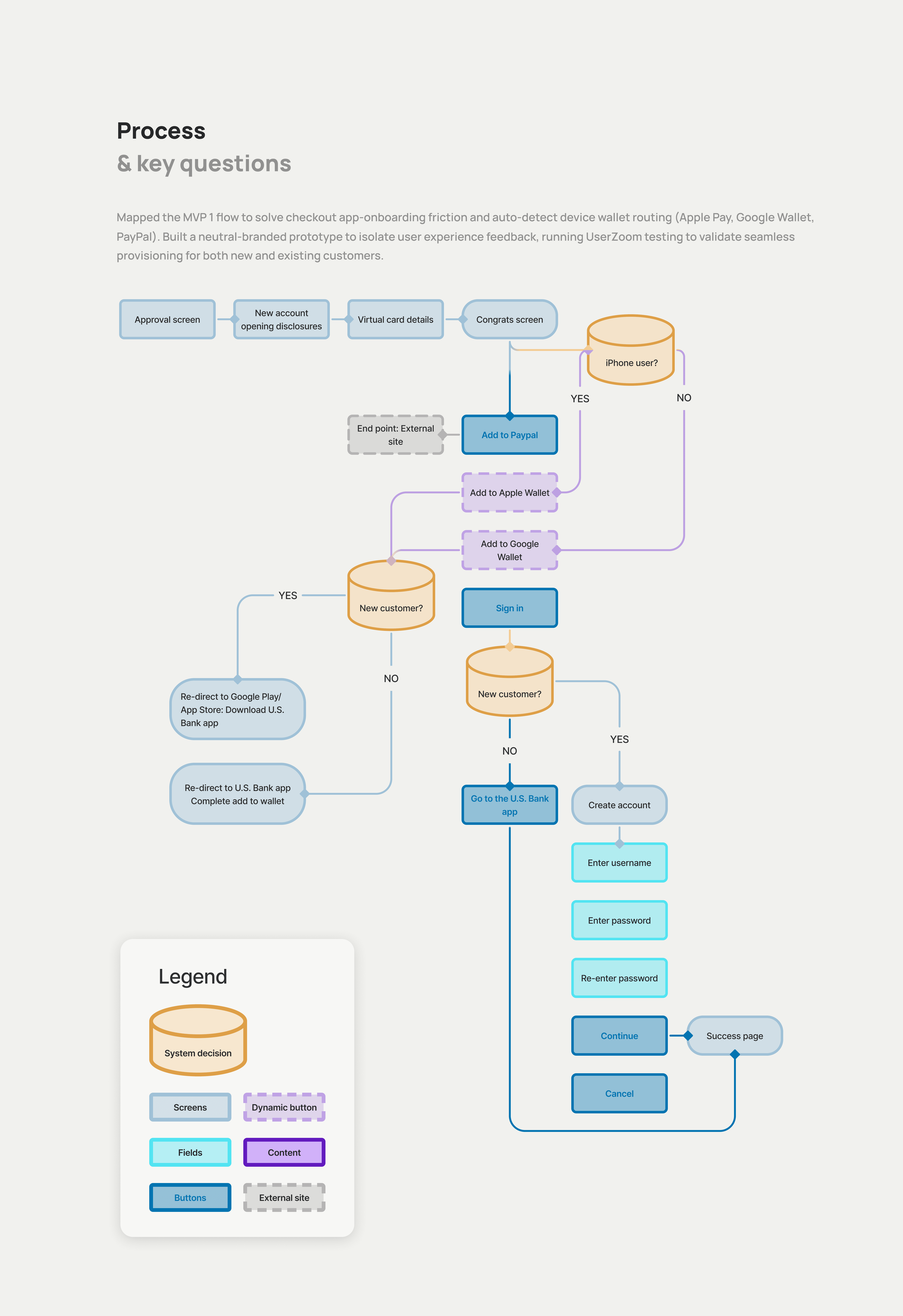
I mapped two parallel flows to drive instant wallet provisioning across different entry points:
• New Customers (Web): Prioritized for testing due to higher drop-off risk from app installation and account setup.
• Existing Customers (App): Streamlined path taking advantage of pre-installed app credentials.
Both flows used flexible, white-label UI templates designed to scale beyond Kroger to future U.S. Bank partners.

Solution
Directions to explore to prioritize user experience
01 · What was working
Intuitive navigation: Created a seamless, easy-to-navigate flow. Plain Language: Used clear, concise messaging to guide users naturally.
02 · What was confusing
Excessive Friction: Too many steps made the overall flow feel unnecessarily long. Delayed Context: App download requirement was introduced late, causing user confusion. Premature Exit: Misleading success copy caused users to drop off before completing setup.
03 · Opportunities
Add progress indicators to keep users oriented throughout the flow. Consolidate steps and trim repetitive copy to minimize friction. Align messaging hierarchy so success cues appear strictly upon task completion. Re-sequence breaks in the flow to drive end-to-end task completion.
