


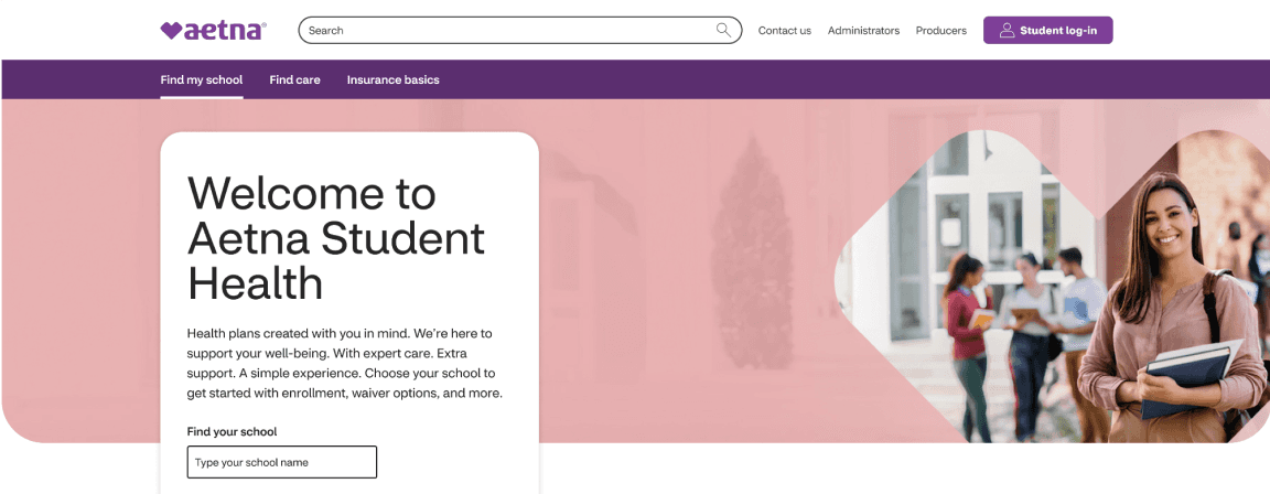
Aetna Student Health
Revenue Impact
$170M+
new premiums
User Impact
35K+
new members
Business Impact
21
new schools
Site Impact
7400
pages down to 618
Shipped
Healthcare · Education · Responsive web · B2C
A fresh redesign for a Fortune 10 healthcare platform serving college students across 33 states.
I joined a 6-month redesign at the halfway point and shipped 20+ pages across the main site, member resources, and footer. In addition to the stats below, the new platform also reduced ongoing maintenance time for content authors by restructuring how plan documents, resources, and forms are shared across schools.
Problem
Aetna Student Health (ASH) provides health insurance to college students across 33 states. The existing website was over 10 years old: 7,400 pages of dense content, no design system, accessibility gaps, and navigation that hadn’t kept pace with how students use sites online.
Solution
A site wide redesign timed to September school onboarding kickoff and align with CVS Health’s Healthier Happens Together platform; a member-first business direction that shaped voice, tone, and imagery across every page.
Role
Senior UX Designer
Timeline
6 months
Team
3 designers, PM, Dev

User Groups
The redesign was built around three user types:
01 · First time enrollees
A US college student signing up for a plan, often without much prior insurance literacy.
02 · International students
Landing in the US and navigating American healthcare for the first time, frequently in a second language.
03 · School Administrators
Managing student health insurance for their institution and onboarding new cohorts.
Process & constraints
Starting from an initial competitive analysis, I designed high-fidelity Figma mockups using established styles and iterated weekly based on stakeholder feedback. I collaborated closely with my Lead Designer and Content Designer on strategy and copy. Finally, I annotated approved designs for AEM implementation and conducted post-handoff reviews to prevent any design to code discrepancies.
Aetna Design System
All components had to come from or extend the existing system.
Accessibility
WCAG 2.1 AA conformance was required across all pages.
Compliance
HIPAA and other healthcare regulations governed how member information could be presented.
Brand layering
We had to ensure the Aetna brand, ASH as a sub-brand and individual schools meshed seamlessly.
User research
External study of 19–26 year olds
42%
Worry about obtaining health insurance
51%
Lack confidence in selecting a healthcare plan
86%
Seek a simpler insurance shopping experience
52%
Of participants rely on friends/family for advice on insurance choices
"Young consumers are not confident managing healthcare and want simplicity."
Key insights & needs
• Streamlined processes
• Straightforward information
• Clearer guidance/resources to assist them
• Dependent on friends/family for advice
Page design
How to Use Your Plan
The original page was a dense wall of text with unorganized PDF links, forcing students to scan everything for a single answer. While descriptive, it lacked clear action paths for critical tasks like finding providers, scheduling appointments, or filing claims.


Hero & Visual Strategy:
Friendly student imagery with an empathetic, unified palette signals learning over legalities.
Journey-Based Tabs:
Categorized content into two care phases to lower cognitive load and match student intent.
Contact box:
Reminding the user of external support available should they need it.
Scannable Copy:
Replaced dense legal prose with action-led key terms bolded inline for fast skimming.
Active Routing:
Replaced dead ends with direct links to tools, forms, and member portals.
Page design
Surprise Billing
The original surprise billing page offered only a single sentence and an external PDF. I replaced this high-friction experience with direct, actionable guidance to reduce stress for students facing unexpected medical bills.


Page design
Get the App
The original design presented a dense flyer layout with heavy purple branding, cramped icons, and redundant app store badges that created visual clutter. Lacking global site navigation and clear hierarchy, it forced users to scan through tightly packed text without an inviting or structured way to explore features.


Site Context & Navigation:
Added global header navigation and search, transforming a static flyer into a fully integrated web experience.
Modernized Hero Layout:
Replaced rigid purple framing with warm, human-centered photography and clear above-the-fold messaging.
Streamlined App Store CTA:
Consolidated redundant SMS/badge prompts into a single, high-contrast download card at the bottom.
Enhanced Visual Breathing Room:
Increased spacing and whitespace to reduce cognitive overload and guide the reader's eye naturally.
Structured Feature Grid:
Expanded cramped features into a scannable 4x2 grid with high-contrast pictograms and direct descriptions.
Page design
School Landing pages
The previous school landing pages were dominated by Aetna's purple, the Aetna brand had completely overtaken the school's identity. A student at Stanford or USC arriving on their school's page felt like they were on a CVS/Aetna page that happened to mention their school, rather than a page made for their school.


School-Led Palette:
Swapped the generic purple wash for school brand colors to create a custom, co-branded feel.
School Logos:
Enlarged school branding to visually anchor the page around the university rather than Aetna.
Tabbed Structure:
Organized core tasks (Enroll, Find Care, Plan Documents) by student priority with clear CTA cards.
Pictogram NBA Gallery:
Added icon-driven links to turn a static landing page into a full navigation hub.
Hero Imagery:
Relatable, emotive visual and unified palette mirror the user’s real-world stress.
Action-Oriented Tabs:
Simplified legal jargon into intent-based 'Why, What, How' tabs to guide next steps.
Contact box:
Reminding the user of external support available should they need it.
Centered Definition:
Plain-language definition positioned above the fold for immediate clarity without scrolling.
Next Best Action Gallery:
Icon-driven links to key tools (Find Care, Glossary, Estimator) turn dead-end copy into an actionable launcher.